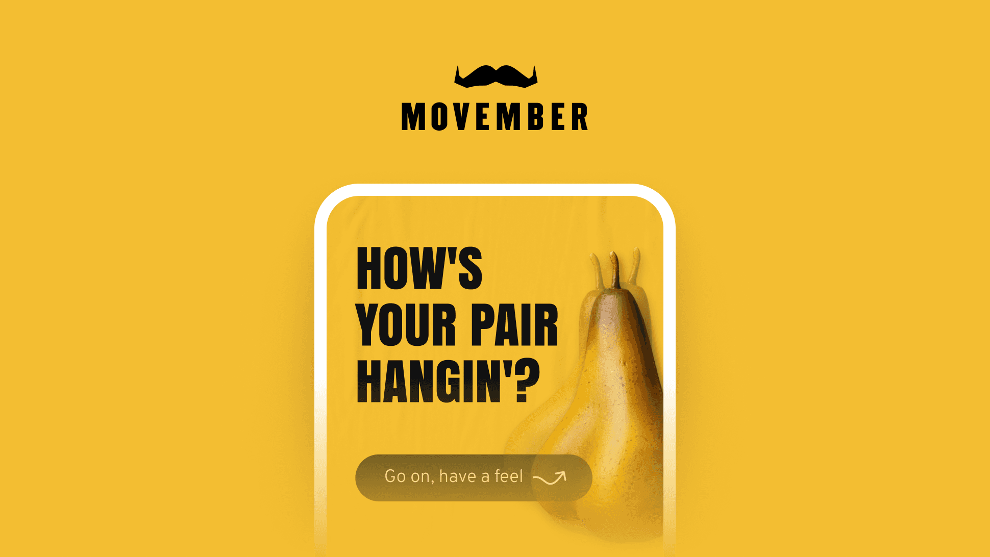
Know Thy Nuts
Transforming testicular cancer awareness into action through engaging design.

Challenge
Previous testicular cancer campaigns focused on education but failed to inspire meaningful action. The Know Thy Nuts campaign aimed to bridge this gap by creating a stigma-free, engaging tool that not only educated men on self-checks but actively motivated them to prioritise their health.
Results
The campaign successfully turned awareness into measurable action, creating a lasting impact among the target audience. Engagement metrics reflected the campaign’s ability to empower users and encourage proactive behaviour.
35%
4 of 5
20%
Understanding the Problem
Insights from past Movember campaigns and audience feedback revealed critical barriers to engagement:
Stigma and Discomfort: Men often felt embarrassed addressing testicular health, hindering participation.
Knowledge Gap: Many lacked clear guidance on how to perform self-checks or identify abnormalities.
Engagement Challenges: Static educational tools lacked interactivity and often failed to sustain attention, leading to low completion rates.
To ensure we addressed these barriers effectively, we conducted workshops with stakeholders, analysed campaign analytics, and referenced survey feedback from previous years. This foundational research shaped the project strategy.
Defining the Approach
To guide men from curiosity to meaningful action, we developed a four-phase strategy that addressed the barriers identified during research.
Strategic Phases:
Reach: Bold, humorous social media content and paid search ads captured attention and drove traffic to the landing page.
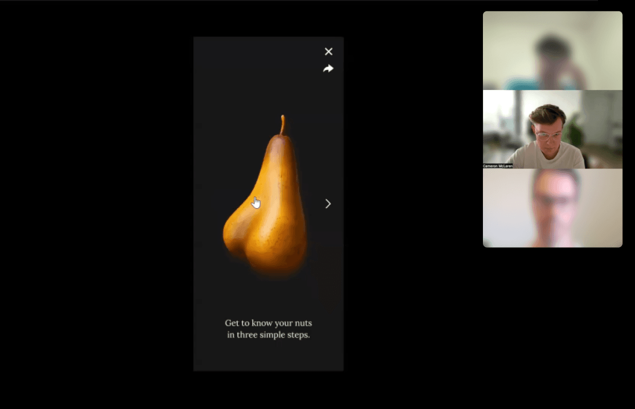
Educate: A step-by-step interactive tool provided clear guidance on how to perform self-checks.
Motivate: Encouraging messaging empowered users to take action if they detected irregularities.
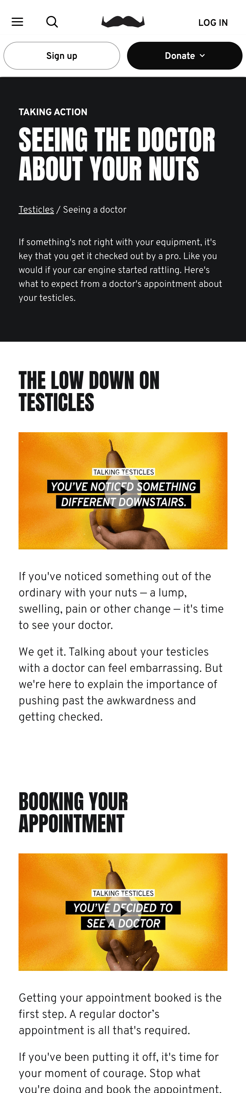
Act: A seamless path to the “Seeing a Doctor” page facilitated follow-up care.
This strategic framework became the foundation for the user journey map, which visualised the entire experience from awareness to action.


Designing the Experience
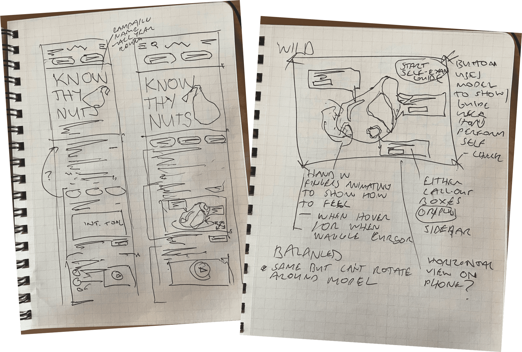
Conceptualising the Tool
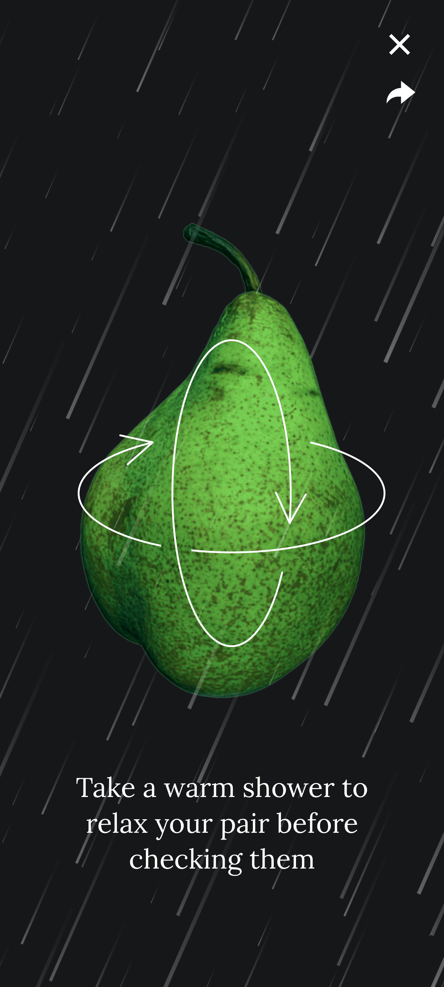
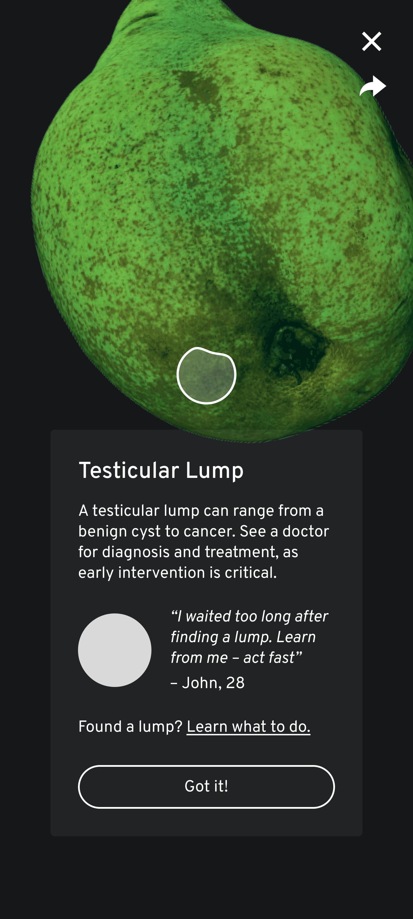
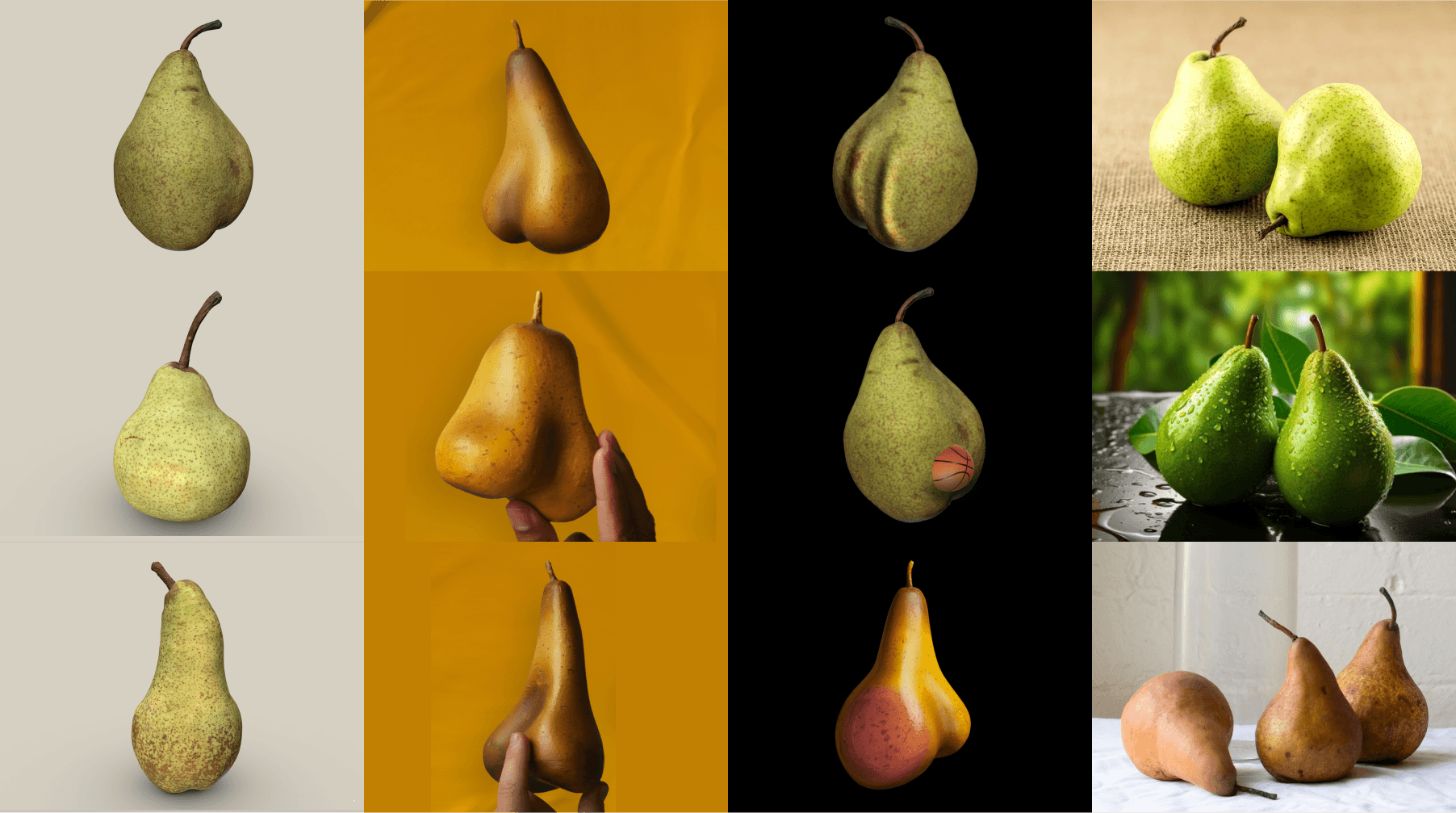
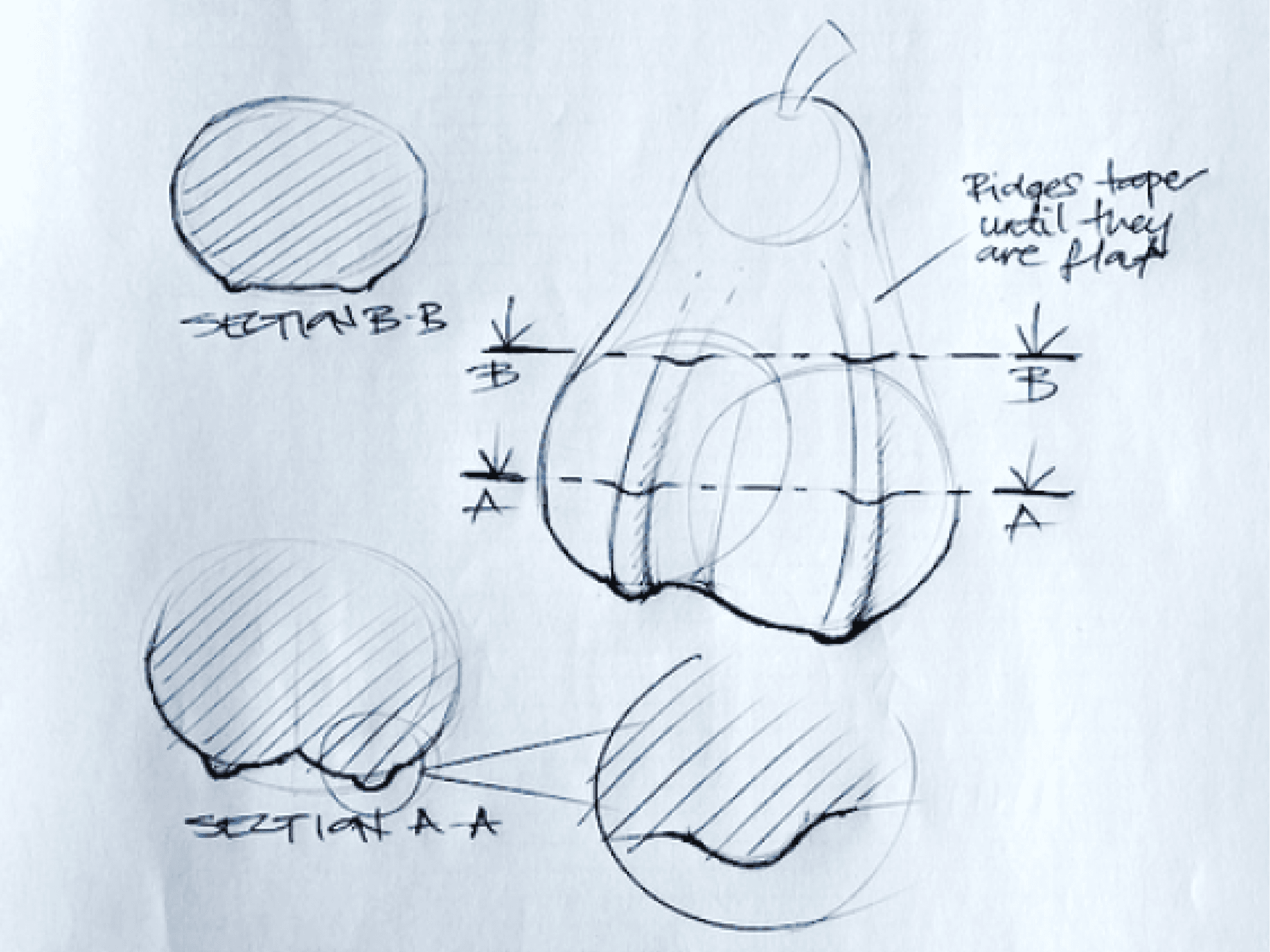
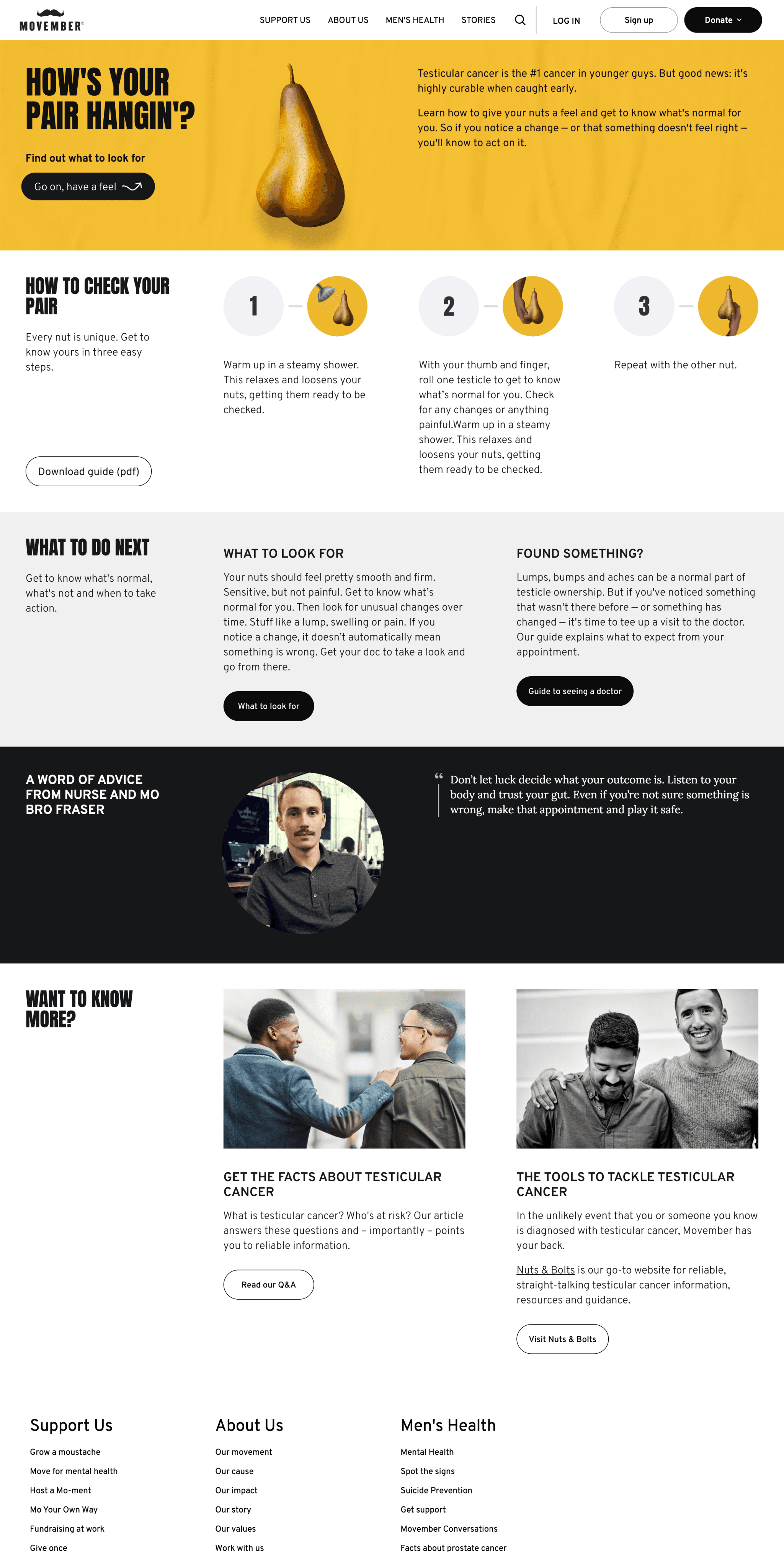
The Know Thy Nuts tool centred around 3D pears, playful yet thoughtful representations of testicles. The pears were designed to educate users about anomalies in a light-hearted way, reducing stigma and encouraging engagement. Each shape, colour, and texture represented a specific anomaly, such as swelling, lumps, or discomfort.
Building the Interactive Tool
Working closely with an external agency, I oversaw the development of the 3D interactive tool, providing detailed specifications to ensure technical feasibility and alignment with campaign goals.
Key Features:
Custom Anomalies: Developed in consultation with medical experts, anomalies were designed to educate users while maintaining a light-hearted tone.
Guided Interactions: Users learned rolling motions and pressure techniques through step-by-step animations.
Accessibility: The tool included alt text, keyboard navigation, and responsive layouts to ensure inclusivity.
Additionally, we designed the surrounding digital experience, including the landing page, follow-up screens, and motivational pathways encouraging users to take the next step.
Testing, Iteration, and Refinements
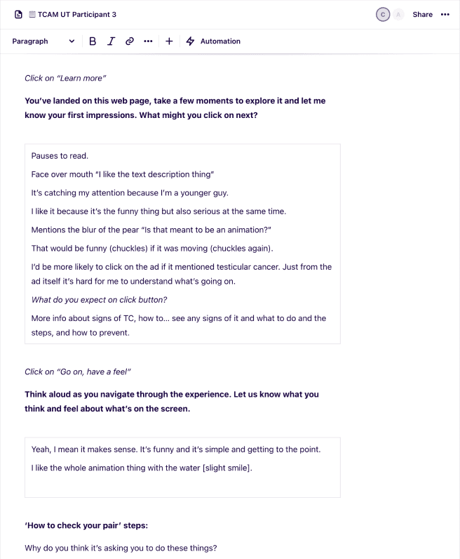
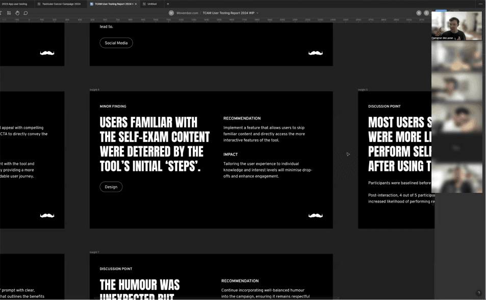
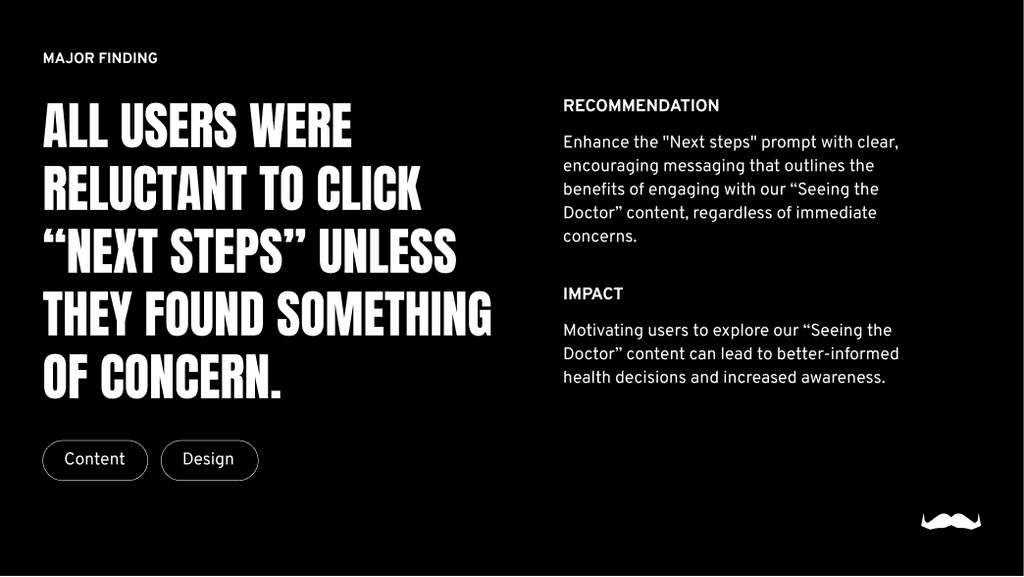
To validate the tool’s effectiveness, we conducted usability testing with five participants aged 19–33. Participants completed the tool and shared feedback through a post-survey designed to assess confidence, comprehension, and motivation.
Key Findings and Solutions:
Unclear CTAs: The phrase “Go on, have a feel” caused hesitation.
Solution: Simplified the CTA to improve clarity and reduce drop-off rates.
Lack of flexibility: Repeat users wanted the ability to skip introductory steps.
Solution: Added a “skip” feature to improve usability.
Motivational messaging: Users hesitated to proceed without clear prompts.
Solution: Added encouraging messages like “Even if everything feels fine, regular checks are key.”
These findings directly informed refinements, ensuring the tool was intuitive, engaging, and actionable.


Retention and Impact
To sustain impact beyond the initial interaction, we implemented a retention phase, including follow-up email reminders and educational resources.
Campaign Outcomes:
35% of users completed the tool, demonstrating strong engagement.
4 out of 5 users likely to self-check, boosting confidence and knowledge.
20% increase in click-throughs to the “Seeing a Doctor” page, driving critical behaviour change.
Reflections and Takeaways
This project demonstrated the power of thoughtful, user-centred design in addressing sensitive topics and inspiring behaviour change.
Key Takeaways:
Iterative design drives results: Usability testing was key to refining the tool’s effectiveness.
Collaboration enables success: Close partnerships with stakeholders and agencies ensured alignment and impact.
Design can empower action: Combining humour with education broke down barriers and inspired users to prioritise their health.
Next Steps:
Expand visibility through targeted social media campaigns.
Introduce gamified features to encourage ongoing engagement.
Partner with health platforms to broaden educational outreach.